Although I do the majority of my work for uploading to a number of sites for online sales there always comes a time when a print is required whether its a simple 6 x 4 for the album or posting to the family or an 18 x 12 to frame up formally. So the first question is do I print at home or travel to town with a jpg on a stick and have someone print it for me. The end result in both cases can often be “Why is the print different to what I see on the screen?”.
And so we enter the wonderful world of colour calibration. I like to print up to A4 at home more for convenience sake, so its essential to me that the colours I see on the screen are the same as those printed. The pc and the printer should share the same colour profile which loads on start up but if the pc profile is wrong to start with it will never match any Pro or local kiosk colour setup.
The monitor profile can be calibrated manually (the harder way) or by a calibrator (the easier way). I use a Spyder 3, though its outdated now it still performs well, which new model just depends on your budget, the following is a link for those interested: http://spyder.datacolor.com/display-calibration/
If I was into portraits then regular monitor calibration would be essential to preserve skin tones. I’m mostly into landscapes so have some leeway although I am aware that my uploaded files need to be seen correctly on other sites and customers monitors.
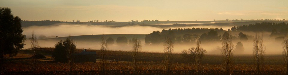
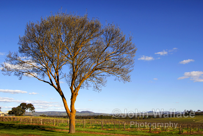
The difference could be as little or as important as seen in these two images:
Calibrated

Un-Calibrated
